Naming, strategy, branding, and website content for a digital payments company.
Duration: 6 weeks Price: $3000
BACK
GROUND
Finlab2000 (as it was previously known) is an innovative payment infrastructure that uses biometrics to authenticate users, preventing fraud and identity theft.
THE
PROBLEM
After successfully launching a service for banks, Finlab2000 wanted to create a brand to connect with two audiences:
Merchants that accept digital payments and their customers, 28–45 year-olds, who provide them.
THE
OBJECTIVE
Develop a brand name, identity, selling proposition, message, and website content targeting two separate audiences.
WORK
Since the client was pursuing both merchants and their customers, we devised a strategy to connect with both and tell a story that was relevant to each one separately.
STRATEGY
First, we broke down the business to its main components:
WHAT: the product WHO: the customer who benefits WHY: the reason they need it HOW: the way the message is going to reach them
BRAND
NAME
DigiDough
Short, playful, and descriptive alliteration, designed to be catchy yet informative.
“Digi” is short for digital, and “Dough” is slang for money.
The client decided to go with “Doe” instead of “Dough,” losing the meaning but gaining in simplicity.
Testing suggested that the name was clear in meaning and sticky in the mind.
MESSAGE
Instead of trying to reach two audiences with generic messaging, we devised two sets of messaging frameworks to connect with the needs and wants of each audience separately.
The priority was the messaging for merchants, since their adoption of the product would be the catalyst for the adoption of their customers (plus, the POS itself was free advertising and helped build a brand in customers’ minds).
IDENTITY
With little to no money for promotions and explanations, we needed something that people could almost recognize.
We decided to go with the traditional shield, symbolizing protection and safety, layered with the first letters of the alliterated brand name.
The color scheme stands out from the crowd and looks clear on the website’s white background, suggesting strength and reliability.
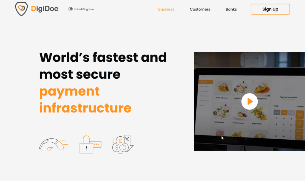
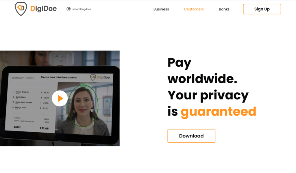
WEBSITE
To create a distinction, we developed two separate pages. One for merchants and another for their customers.
Each page addressed concerns and provided relevant solutions for each audience.
DELIVERY
Brand name, strategy, messaging, selling proposition, story, and website content.
In addition, we created two separate video explainers for merchants and their customers.